To help keep my mind occupied a couple years ago, I embarked on a winter project to help me visualize some unique insights into my Strava activities. Commits range from October 2021 through February 2023. It’s been a pretty fun project, but I’ve found that my mental health is better when I focus on hobbies that are not too similar to my work.
Activity View
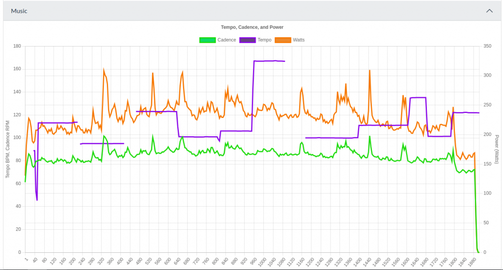
One of my main motivations for starting this project was to attempt to correlate my cycling cadence and power with the tempo of the music I was listening to. The short answer is no, the environment (and virtual environment) seems to have much more of an effect than my music, but it was fun to visualize.
Because we can’t be completely boring, I began with some basic stats and a map:
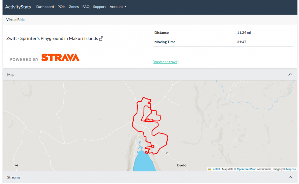
An activity view then shows some stats. First is a speed chart (which is unremarkable). Below that is a chart showing cycling cadence (revolutions per minute), tempo of the music (beats per minute), and power output (watts) together.
This was a pretty fun dataset to put together. The activity data is all pulled from the Strava API. This is combined with the user’s Spotify listening history. For each track, both the audio features and audio analysis are retrieved and stored. A large dataframe is then created merging all data, so it can be charted.
The Spotify API has a lot of other really cool metrics that could be charted as well, such as the acousticness, danceability, energy, liveness, loudness, and speechiness of a track. This is currently collected, but not displayed.
Zones
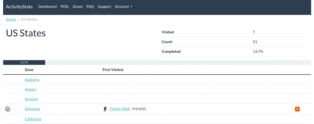
I realized once I had a catalog of all my Strava data that I could analyze it against publicly available GIS data, such as all the US States and US National Parks. This involved taking multi-polygon objects from ArcGIS Hub and looking for intersections with the linestrings typically generated from Strava Activities. A third one was generated manually in QGIS to cover some of the climb peaks in Zwift.
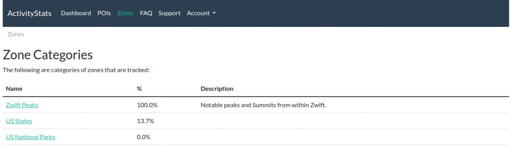
The main page for a Zone category will show a percentage of completion, and a list of zones and the first activity completed in each.
When viewing a zone’s page, you can also see a map, some quick stats, the first activity created, a list of each activity completed in the zone:

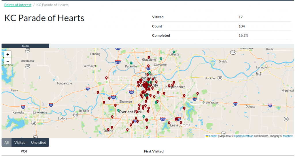
Points of Interest
In 2022, the Parade of Hearts began in Kansas City, and my Strava feed was flooded with rides designed to see as many hearts as possible, and I wanted to support tracking this. While the zones could definitely be used to track this, I felt it was overall more efficient to store just the coordinate of each heart, and count visits as an activity that comes with a configurable distance of that coordinate. Therefore, POI’s were born, and because I didn’t want to spend my time doing data entry, I found a Google Maps list of the hearts, downloaded the .kml file, and scripted an import process.
A POI Category, like the Parade of Hearts, will show a few basic stats, a color coded map, and a list of each with visit information.
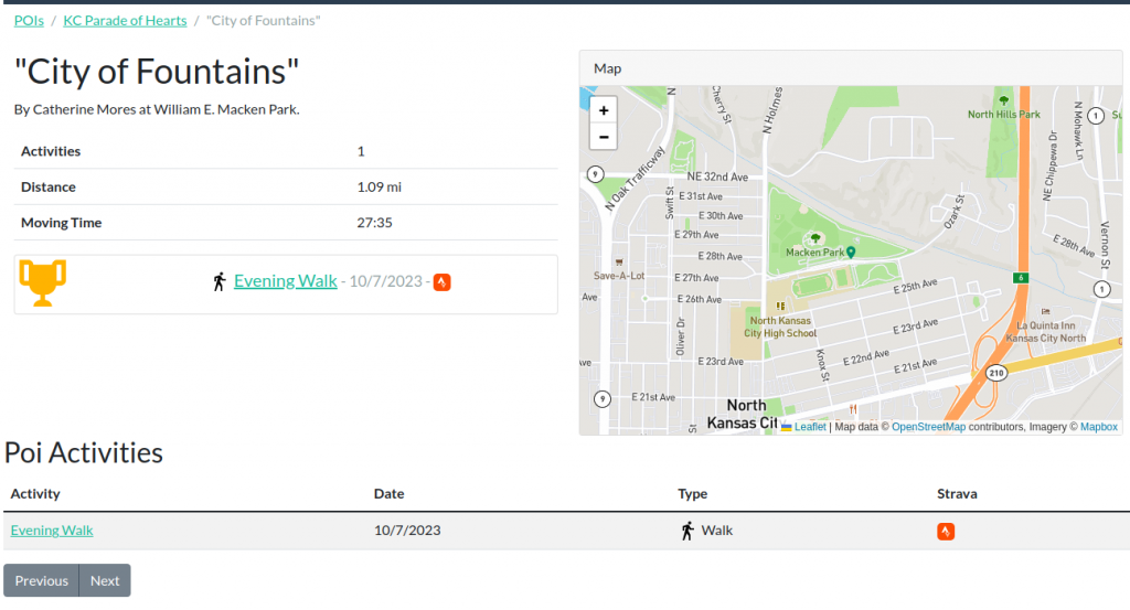
Then, each POI will also have a page showing the point, the first activity visiting the point, and a list of all activities below.
Tech Stuff
Backend
The backend code is all Python. The bulk is Django with GeoDjango to handle the maps and detection of object intersection and proximity. Django Ninja was chosen as an API framework due to it’s simplicity, strong typing support, and Swagger page. The obvious choice for a database was PostgreSQL with PostGIS.
In order to gather and analyze this data, a backend task framework called Celery was used. Redis was chosen as a message broker, as it’s use could later be expanded to include caching. All of the analysis took place using Pandas.
Frontend
I’m not really a frontend developer, so I relied heavily on Bootstrap for the layout and Bootswatch for a better color scheme.
I used JQuery, Chart.js, and Leaflet.js to put together my ajax views, draw charts, and maps. The map tiles all come from Mapbox.
The basic page structure, like the layout and navigation menus are generated on the backend, but most of the page content is retrieved and rendered using ajax.
Automation and Deployment
The code currently lives in a private GitLab repo. GitLab CI is used to periodically rebuild docker images, which are then updated automatically via Watchtower. While the code is not actively being worked on, weekly image updates are still performed to ensure up to date patches are applied to the base images.
Future of the Project
Working on this project is too similar to how I spend my days at work, so I’ve ceased active development to avoid burnout. I would love to see an enterprising developer or team fork the work, and continue development.